USA Sod & Landscaping · Miami, FL · Concept set
One business,
five websites.
We built five completely different concepts for the same company — not five color swaps, five different ways of telling the story. Each one is a full, working page: real copy, real structure, concept imagery. Click through, live with each for a minute, and tell us which one feels like your crew. Whichever you pick becomes the starting point for the final site, and we rebuild it with your photos, your service area, and your pricing.
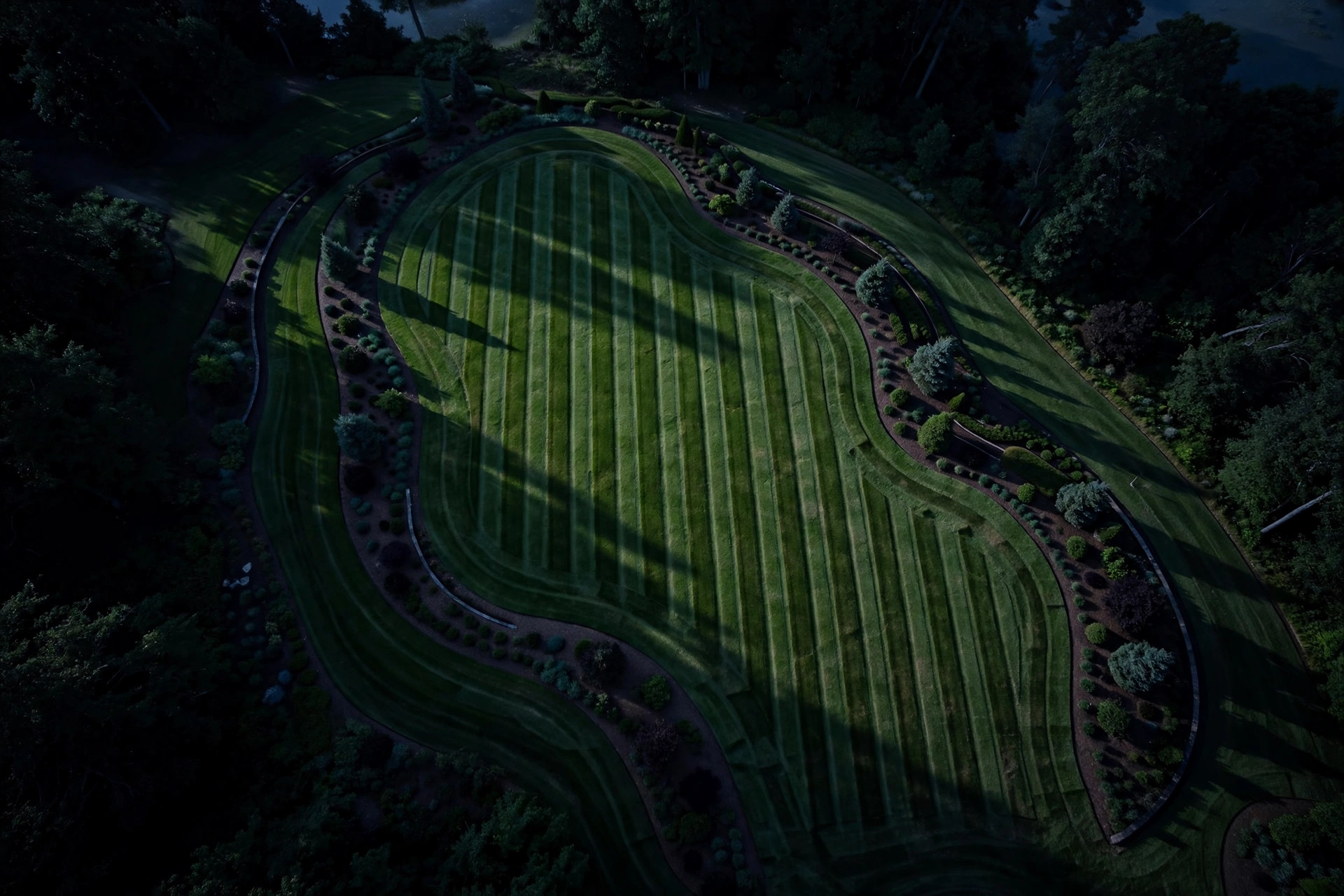
The Portfolio
Dark · Bold type · Work-first
This one treats your crew like a design studio. A giant headline, a photo marquee that moves as you scroll, and your services listed like an index — numbered, confident, no fluff. Past jobs stack on top of each other as you scroll through them. Best if you want the site to feel established and a little fearless, and you have strong job photos to show off. The dark background makes green grass look electric.
Open concept → 02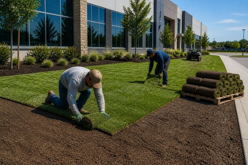
The Story
Scroll-driven · Cinematic · Step by step
Built like a short film you scroll through. It opens on a full-screen shot of the crew at work, then a black panel slides up and walks the visitor through your process in six moves — soil, grass, lay, water, design, care — with photos that grow and shrink as they pass. It ends on a white screen with one button: call. Best if your selling point is how you work, not just that you work. Premium feel, made for phone scrolling.
Open concept → 03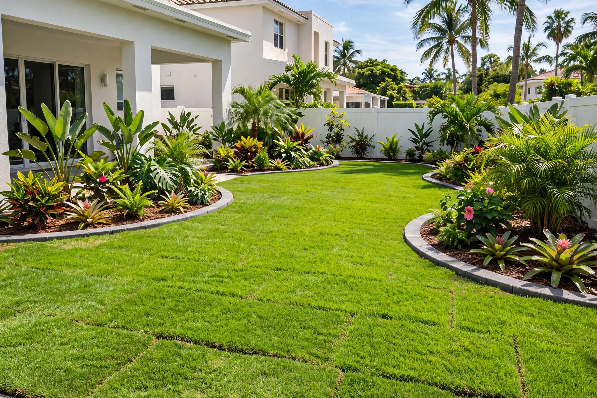
The Mosaic
Cards · Black & white · Local service
Three full screens, each one a mosaic of cards cut from the same photograph — like tiles from one big picture of a finished lawn. A counting loader opens the page, then: who you are, what you do, and exactly how a job runs, step by step. Heavy type, generous spacing, zero decoration that isn’t doing work. Best if you want to look sharp and trustworthy to homeowners comparing three tabs side by side.
Open concept → 04
The Studio
White · Editorial · Calm
The quiet one. Lots of white space, fine typography, and copy that reads like a letter from the owner — who you are, how you think about lawns, what things cost. A photo strip drifts by on its own, two clear pricing cards sit side by side, and past work is presented like a gallery wall. Best if your customers are design-conscious homeowners who read everything before they call. Understated, but every detail is deliberate.
Open concept → 05
The Poster
Single screen · Interactive · Bold
No scrolling at all — one poster that fills the screen. A giant wordmark, a dramatic lawn at sunset, and a trick: move your mouse and it erases the foreground photo to reveal a second image underneath, like wiping fog off glass. Services, process, and pricing live one tap away in the menu. Best if you want to be remembered — this is the one people send to a friend and say “look at this.”
Open concept →