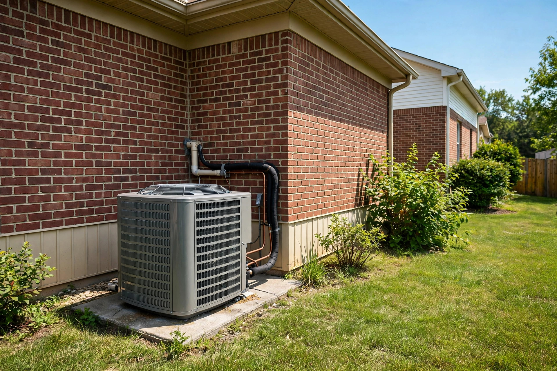
The shop, in one paragraph
Flat-rate pricing agreed in writing before work starts. Diagnosis included in every visit. Drop cloths down before tools come out. If a repair doesn’t make financial sense — a rusted-out tank, a compressor on its last legs — we say so and put the repair-versus-replace math on paper. Emergency calls ring a real person, and we’d rather talk you out of a midnight visit than bill you for one you didn’t need. That’s the whole pitch, and every chapter below says it differently.


The Midnight Ledger
Dark, loud, after-hours energy. A giant-type hero with a magnetic portrait, a scroll-driven photo river of the work, a white index of every service with sample pricing, and job cards that stack like case files.
For the customer who wants to see the work, not read about it.
Open →The Long Scroll
One service call told as a scroll-driven story: the call, the knock, the price, the fix. Fixed interface over a full-bleed visual, a black gallery panel that rises to swallow the hero, scattered job photos that scale in and out as you read, and a white finale with sample numbers.
For the customer who reads everything before calling.
Open →The Card Wall
Black and white, all business. Cards share one big photograph like windows cut from the same sheet — a mosaic that reads as one image and many. Three full screens: the pitch, the services, the process. A splash counter opens the show.
For the customer deciding in ninety seconds.
Open →The White Page
Quiet, spacious, plain-spoken. A narrow column that reads like a letter from the owner, an endless band of shop photography, two honest pricing cards, a week-in-the-van journal, and a hover playground before the footer.
For the customer who distrusts loud websites.
Open →The Poster
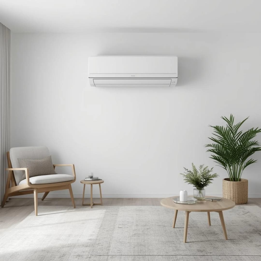
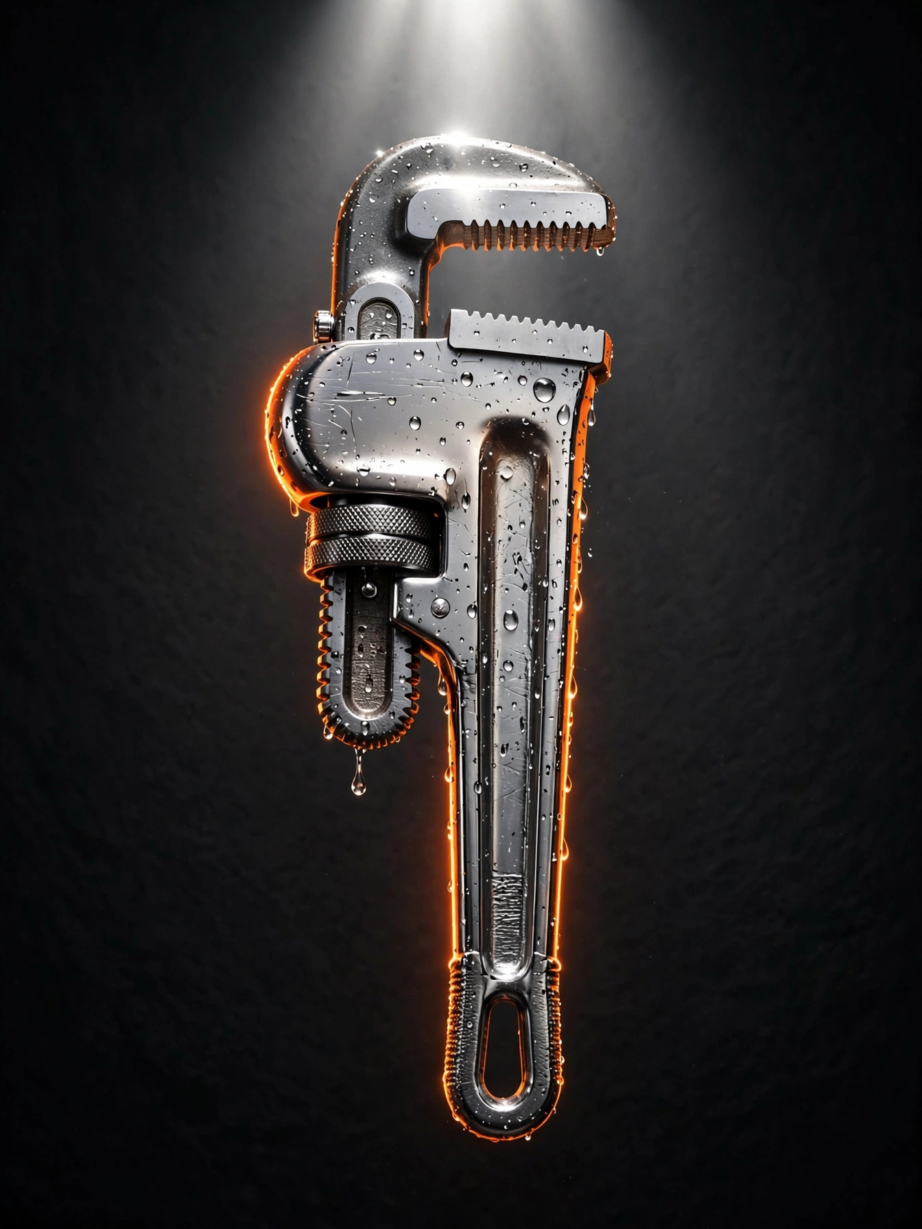
One screen, no scrolling, all nerve. A giant wordmark, a spotlighted wrench, four corners of copy — and a cursor that erases the foreground to reveal a second image underneath in a living, morphing trail.
For the customer you meet once, memorably.
Open →