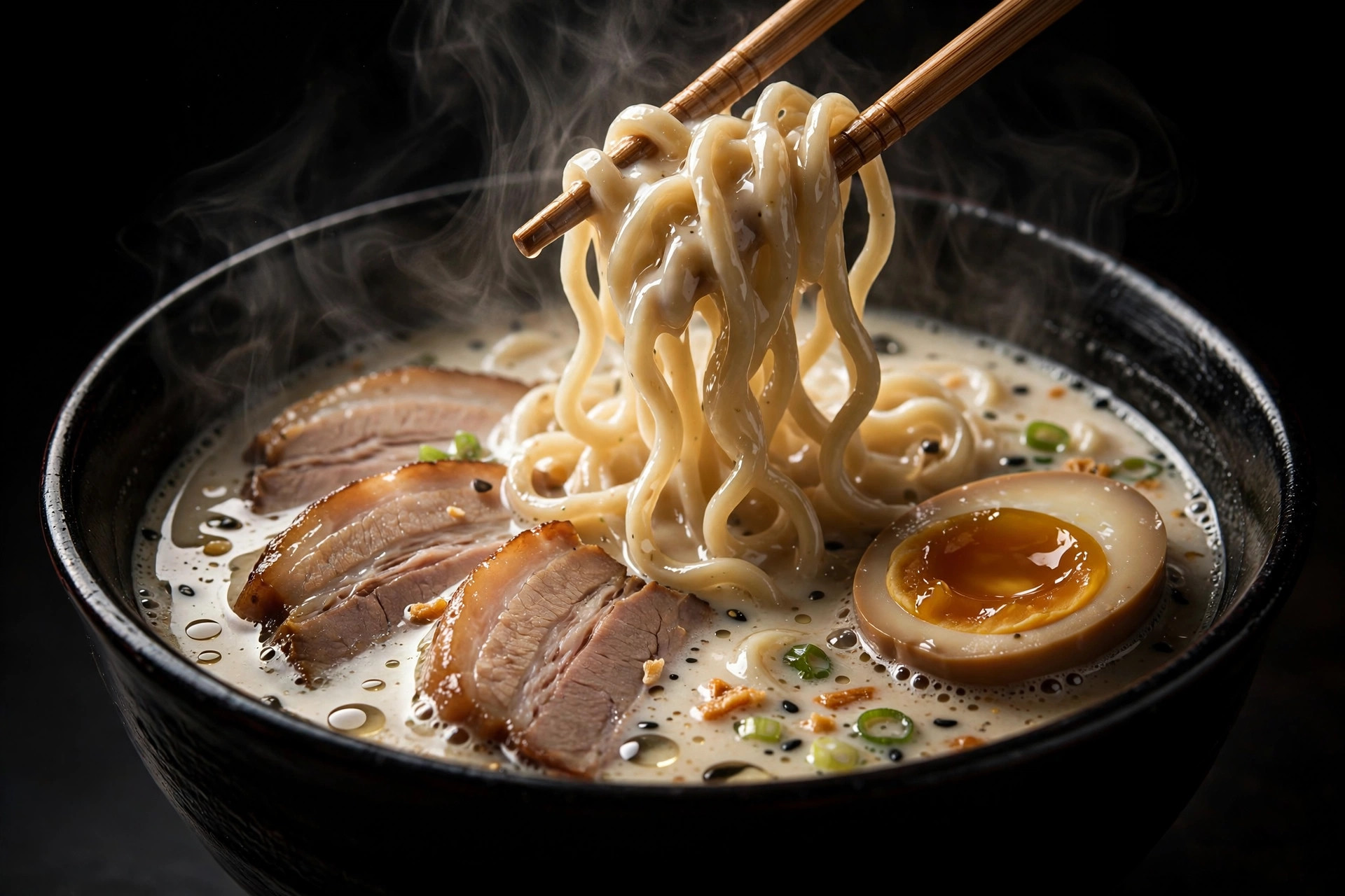
Midnight
Dark, loud, and proud of it. Giant type, a magnetic hero photo, dishes scrolling past like a film reel, and the signature bowls stacked like a deck of cards. For the late-night crowd.
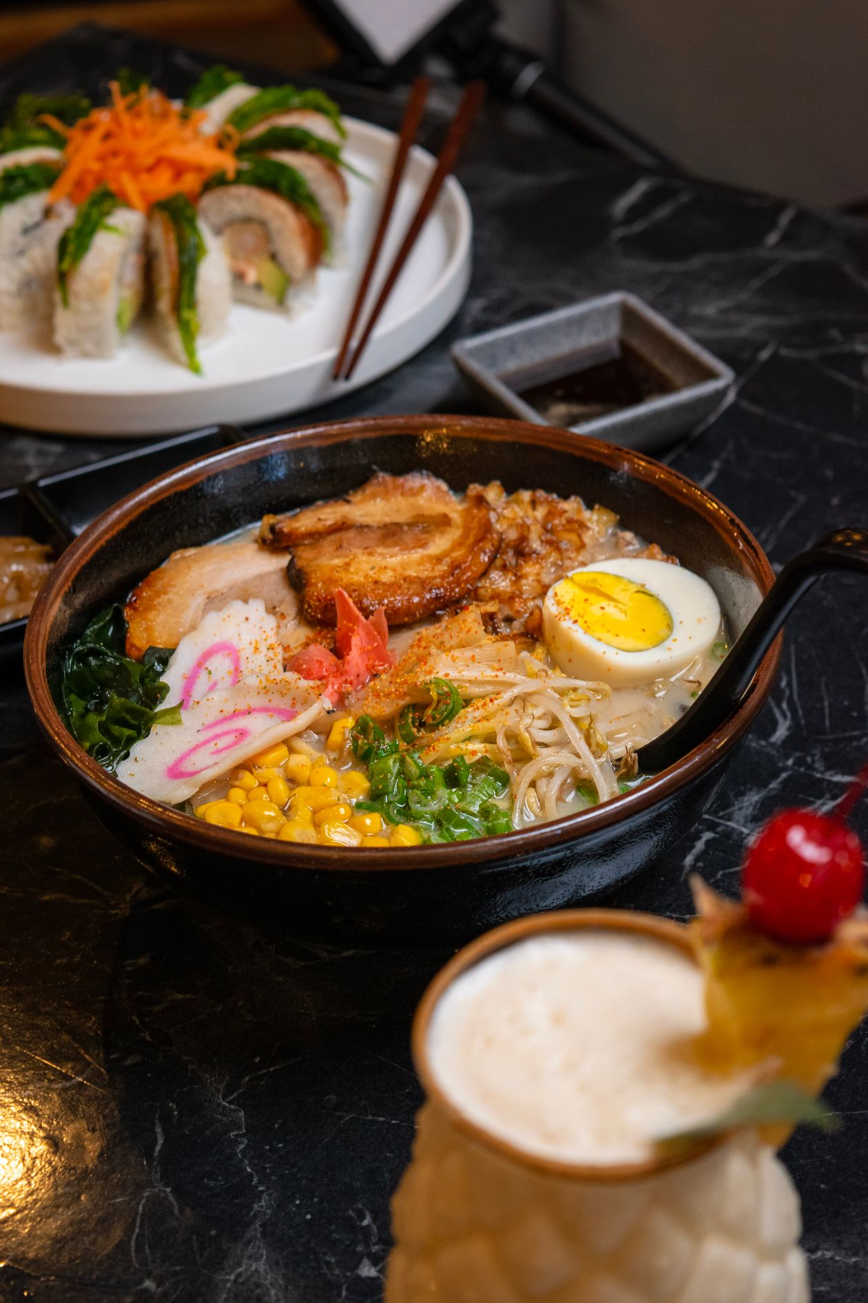
The Scroll Story
One long scroll, two acts. It opens on a full-screen photo of the table, then a black panel rises and lays the whole menu out like an archive — every dish scaling into view as you read down.
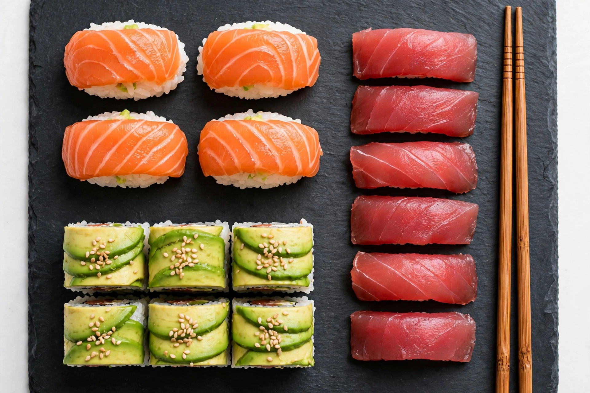
Mosaic
Clean black-and-white cards that fit together like a puzzle — every card is a window onto the same photograph. Three full screens: the welcome, the menu, and how the kitchen works.
Daylight
White, calm, and confident. Lots of breathing room, an honest lunch set and omakase menu, kitchen notes instead of marketing speak, and dishes presented one at a time like a gallery wall.
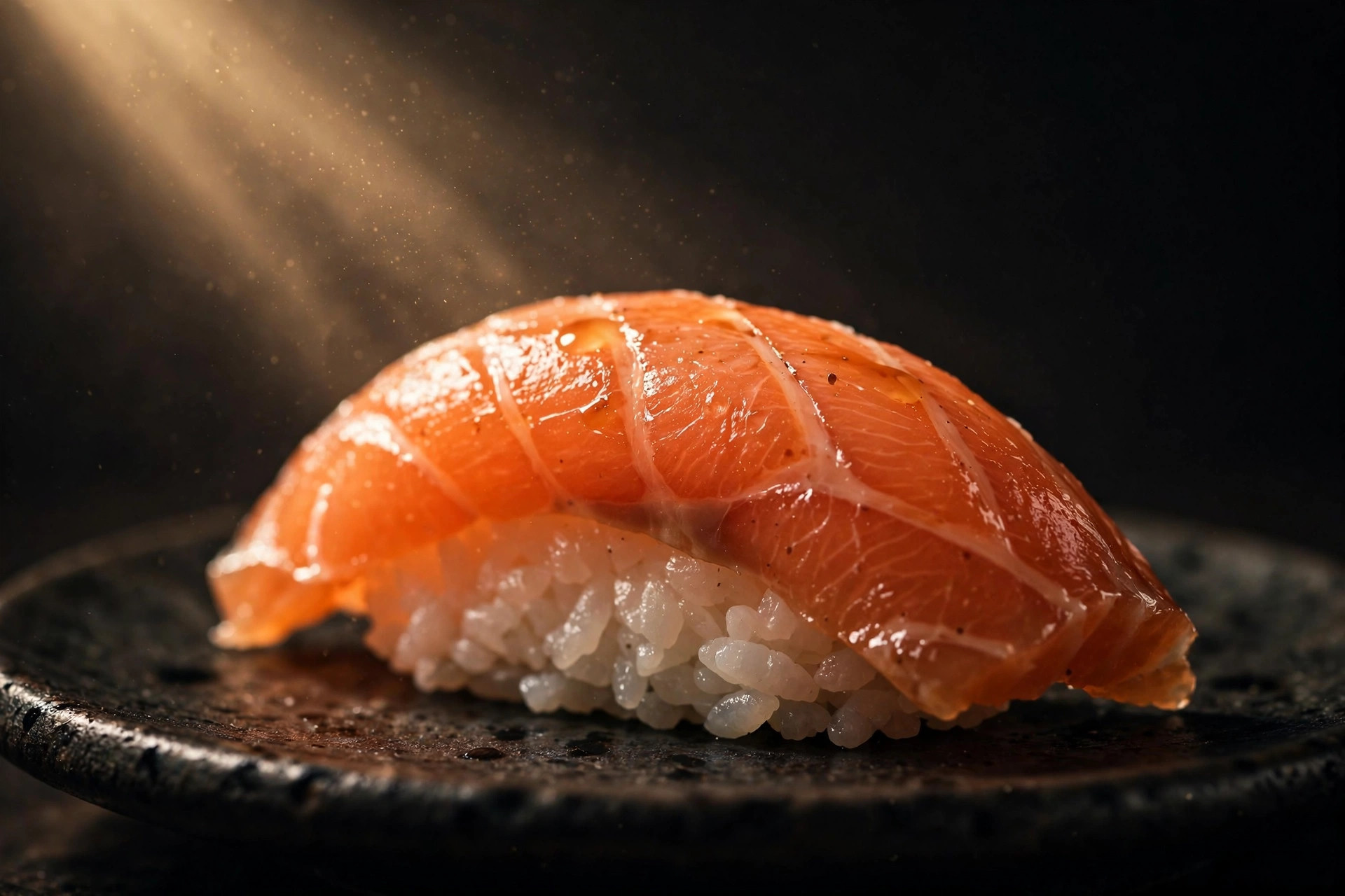
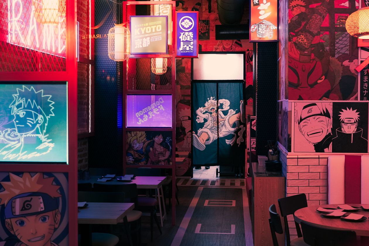
Night Poster
No scrolling at all — one poster for the whole restaurant. Move your cursor and it brushes the steam aside to reveal what's underneath. Built for the phone screen and the after-dark mood.